Editor's Introduction
"Electronic media like the internet extend television's promise of liveness, structuring a sense of a connected presence in time that users come to feel they somehow control and move through in the click or the scroll. This sense of volitional mobility, of navigating the now, is often an illusion, no more empirically real than was the much-heralded, seldom-realized liveness of TV. Yet the sensation is powerful. We turn to the web to find out what's going on right now, from the weather to the stock market to the news. What we often find is a mass of information that is hard to make sense of and harder still to analyze. Certainly, electronic media deliver dynamic streams of data, but just what are we to do with them?
In the News poses one possible answer: visualize them. This project creates a dynamic, real-time view of what's 'in the news' on Google, a view that gives evidence of what one major news source frames as worthy of our attention. In the News harnesses the processing power of the computer to the raw data feeds that course 'behind' our screens, allowing us to 'see' the news differently. What we encounter on Google's news site as constantly-refreshed and categorized text here morphs into visual diagrams that instantly reveal the shifting terrains of the newsworthy, charting these shifts day after day, and week after week. As such, In the News functions as a series of dynamic 'sparklines,' those data-rich, highly legible graphics that Edward Tufte champions in his book Beautiful Evidence.
In the News functions as visual evidence, parsing Google in new ways, but it is also a tool that can be generalized to other datasets, allowing new visualizations and statistical graphics that, in Tufte's words, 'increase the amount of data in our eyespan' and take advantage of our capacity to process and draw distinctions among visual data. Thus, In the News joins The Stolen Time Archive and the Vectors' editors in insisting that tools can also be theories." – Tara McPherson and Steve Anderson, Vectors Editors
Author's Statement
"The amount of news available online continues to grow. 'The news' flies by us [continuously], from thousands of different sources, and often passes out of sight as the next topic rolls forward. This real-time, always-on state of affairs greatly adds to a sense of connectedness to 'what's happening now,' especially during times of high interest in the news - but it can be difficult to make sense of it all, especially given the wide variety of news sources available.
Google.com's solution to this problem is an online news aggregator. Drawing from 4,500 different online sources, their search algorithms compare stories across multiple news feeds, collect similar articles into clusters, and update the results every 15 minutes. The result is a remarkable real-time aggregation of what's 'in the news' at any given moment.
The thrill of real-time news is certainly real - but this window into the news' continuous flow can engender a sense of flatness and superficiality in relation to the world. Looking at online news in this way, the time is always now - and what's on now is all that matters. A broader understanding of the news requires deeper analysis, and the maintenance of an historical record to support that analysis.
Stamen's In The News project seeks to address this issue by providing two kinds of visualizations:
'¢ what's making news headlines right now, and
'¢ what made headlines yesterday, and in the days before that.
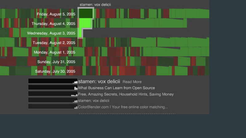
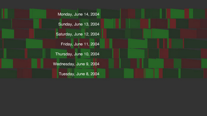
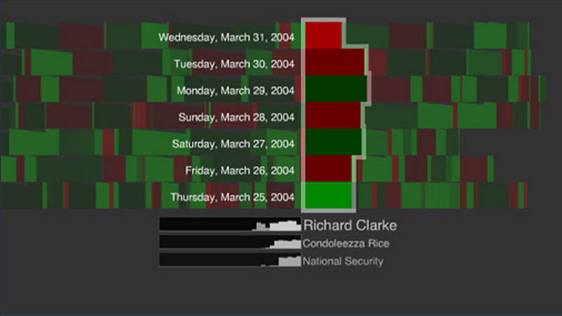
The project collates the data from google's 'In The News' sidebar every 15 minutes. Since these updates happen on a regular schedule, every day, the relative incidence of each term may be shown as a larger or smaller box in a simple bar chart representing a single day:
Juxtaposing the current day's bar chart with the previous day's allows for easy visual comparison, and terms are color-coded depending on whether they are rising or falling relative to the previous day's proportions. In the graphic below, the current incidence of 'Sinn Fein' has increased since the previous day, so it is colored red:
Over time, a visual mapping of a news items' prominence is built, allowing for immediate visual cues as to the progress of a term over a week. Each selection generates a sparkline underneath the week's visualization, allowing for the ability to understand multiple simultaneous trends in a weekly news cycle, with links back to google's results for that term:
What we start to see is that by continuously pulling small, discreet, commonly formatted pieces of data together, information can not only be visualized, but built up over time, dynamically, providing additional levels of depth and meaning. And these displays can be set up in such a way that they're always current - they provide a continuously updated visualization that not only provides a snapshot of the current state of a system, but can build these snapshots into something more interesting.
It's important to note that this data is not published by google in a manner intended for re-publication. These visualizations require custom-built scrapers to gather and coallate the data. Nevertheless, this information is out there - google news is only one of many sources that could be used to create these kinds of presentation views.
The project opens up the potential for a wide variety of questions which could be asked and answered via these kinds of mechanisms. For example: news stories could be tracked not only by how many times they show up in google news, but how often they show up in different media sources - exposing a relative bias in groups of media organizations. Other events could be mapped to these news terms - it might be interesting to view historical stock market data relative to the rise and fall of certain news stories over time.
A desire for this kind of visualization has some precedent - Julius Civitatus famously [mapped] George Bush's approval ratings to terror alerts in 2004, and there are many other examples. What In The News points to, however, is a path towards a different kind of analysis - one that is continuously generated, publicly available, and automatically generates it's own history. Evidence, in this context, is a growing, living diagram - embedded in and emerging from a constant flow of data. -- Eric Rodenbeck and Michal Migurski
Eric was born and raised in New York City where he studied architecture at Cooper Union. After completing his degree in the history and philosophy of technology from the New School for Social Research, he moved to San Francisco in 1994, lured by the nascent technology and media industry. In addition to Stamen, Rodenbeck has designed and built at Quokka, Umwow and Wired. His iconoclastic work has been featured in some of the most adventurous sites on the web, including Eye Magazine, The Remedi Project, K10K, The Codex Series, and Creative Review.
In 1997 Eric founded Stamen Design in order to explore the intersection of graphic design, interactive narratives and online storytelling. His reputation as a maverick eager to extend the possibilities of interactive experiences on the web has attracted a growing client list to Stamen, including BMW, Macromedia, Moveon, and the San Francisco Museum of Modern Art.
Michal has been building for the web since 1995. Michal's skills range from unix system administration to information architecture, and he specializes in creative technology integration and problem solving under pressure. He focuses primarily on server-side multi-user application development using a wide suite of open-source tools, including PHP, Apache, MySQL, and PostgreSQL, and tying those applications into disparate frontends ranging from Macromedia's Flash to XML and W3C standards-based HTML." -- from Vectors, Volume 1, Issue 1, Fall 2005
1 COPY IN THE NEXT
Published in Winter, 2005 by Vectors in Volume 1, Issue 1.
This copy was given to the Electronic Literature Lab by Erik Loyer in November of 2021.
PUBLICATION TYPE
Online Journal
COPY MEDIA FORMAT
Web